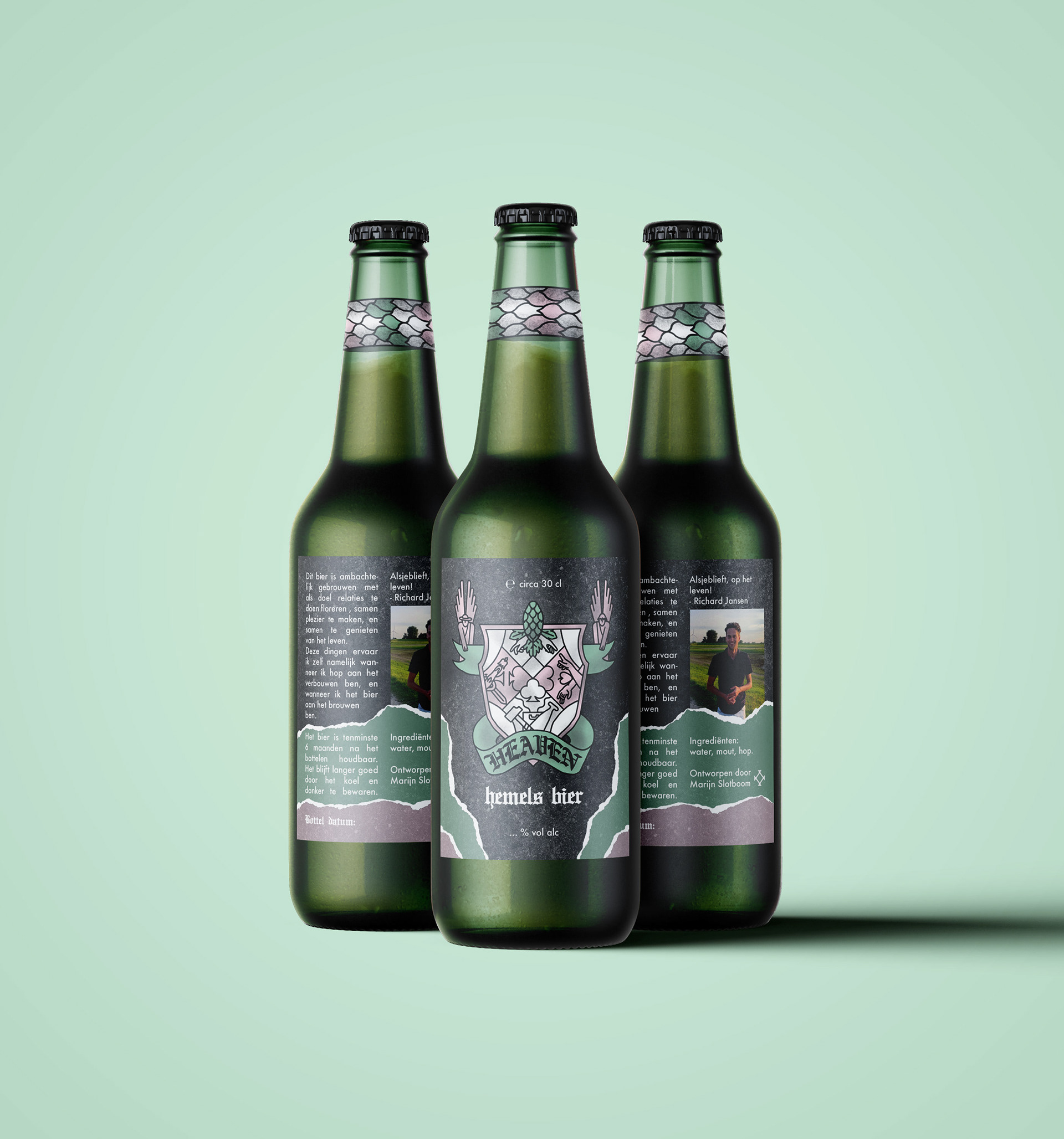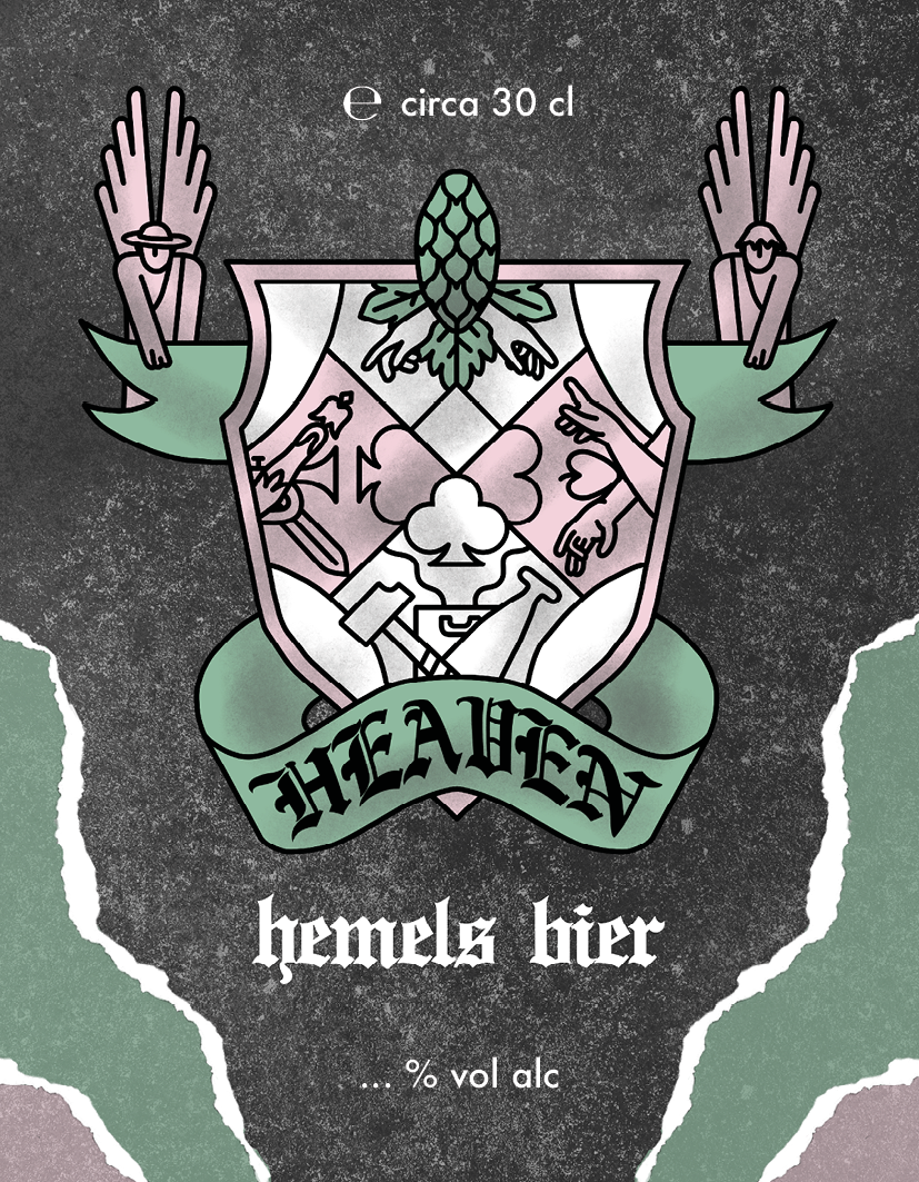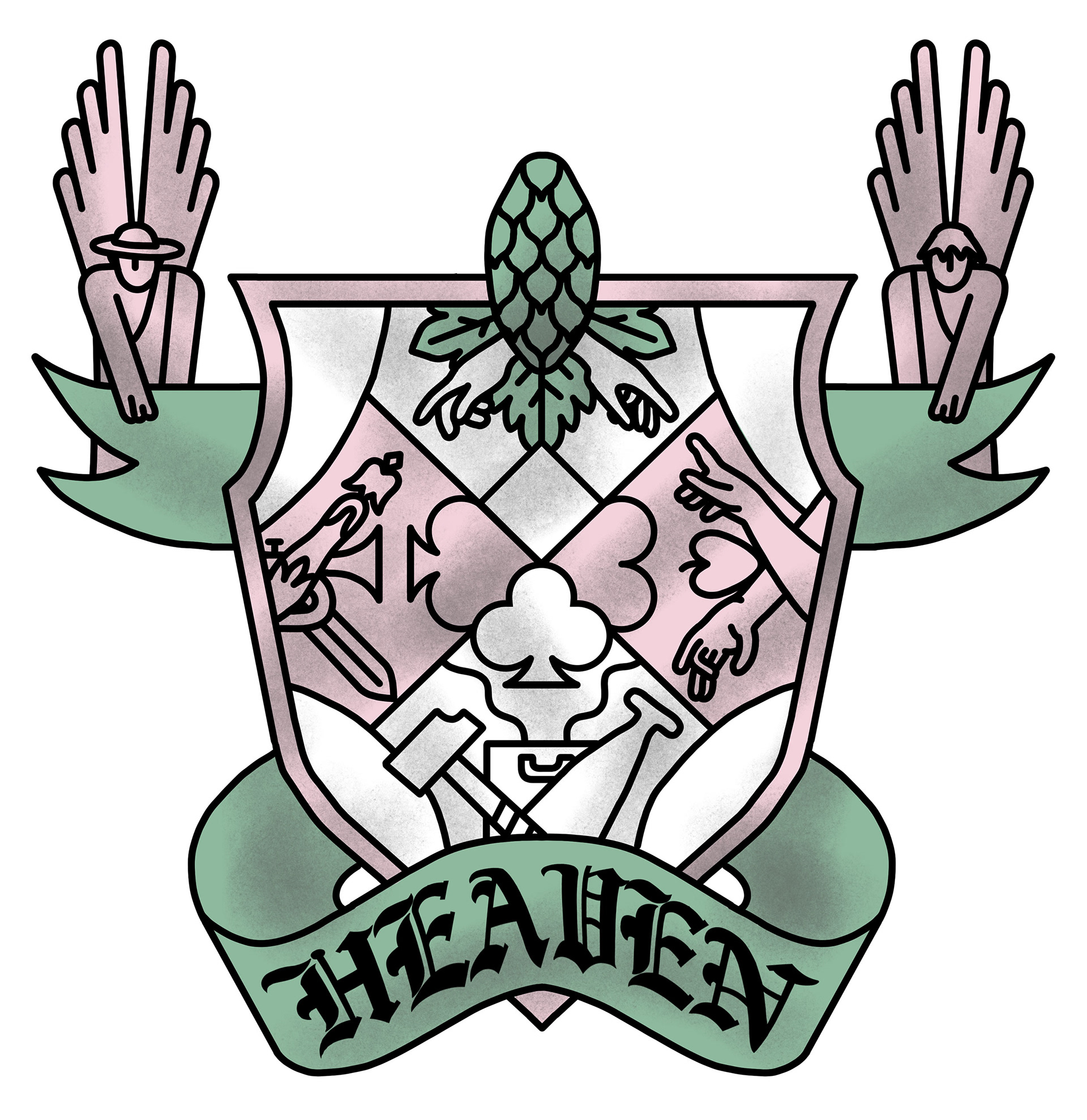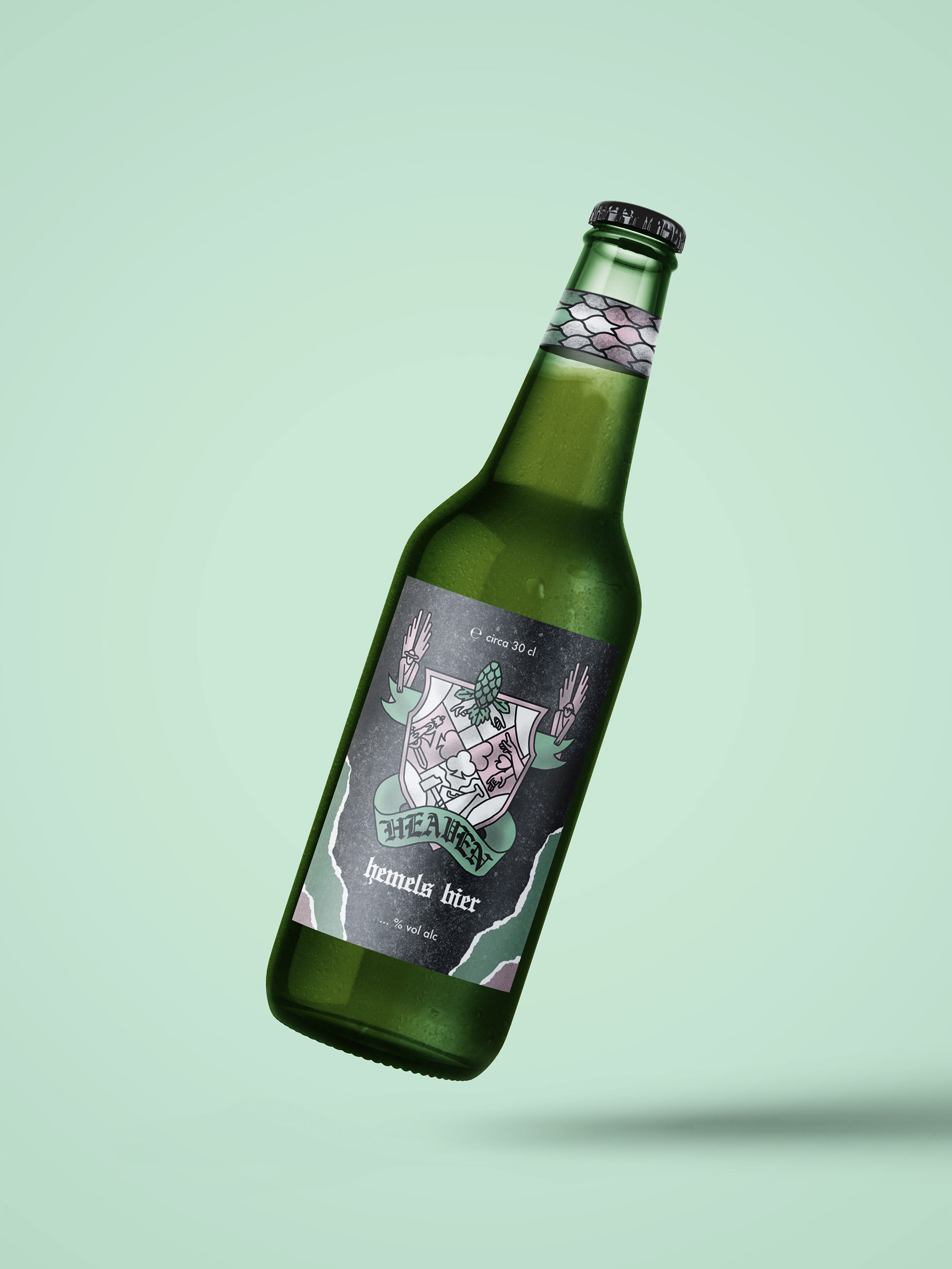
I was asked to create this brand to be able to convey the ideas of this beer. We had the idea to create a family weapon, just like in medieval times, but to make it more modern. So I used a graphic simplistic style and used pastel colors to make it more light and fresh. It stands out that way. I was thinking a lot about the playing cards suits, because each one stands for something and I could really see them connect with the core values of Richard the brewer. Hearts are for spirit and represented the monks who cultivated beer brewing. Spirit is connected to passion and calling and I can see these coming back in this beer. Diamonds stand for traders en citizens, so this symbol reminds me of life and connection. Spades is connected to farmers and workers and represents fertility and craft. Finally clovers stands for nobility and to me this meant authority and status. For me this is connected to having a grand purpose in your life and pursuing it with all your might. These were all great values to really create a brand of authenticity, hard work, quality, love and kindness.